Overview
The CSAUS logo was a test of elegance in simplicity and detail. I approached this project with a knowledge of previous student organization logos. Far too often these logos are plagued by poor craftsmanship. Sometimes the logo is created hastily in a manner that does not take into account proper design elements. Other designers go too far, attempting to add in every recommendation or feature of an organization, creating what is ultimately a cluttered design that is not easily replicable or understood. Still others will create something too simplistic which risks becoming ambiguous, especially for an organization that is not, say, a well-known company.
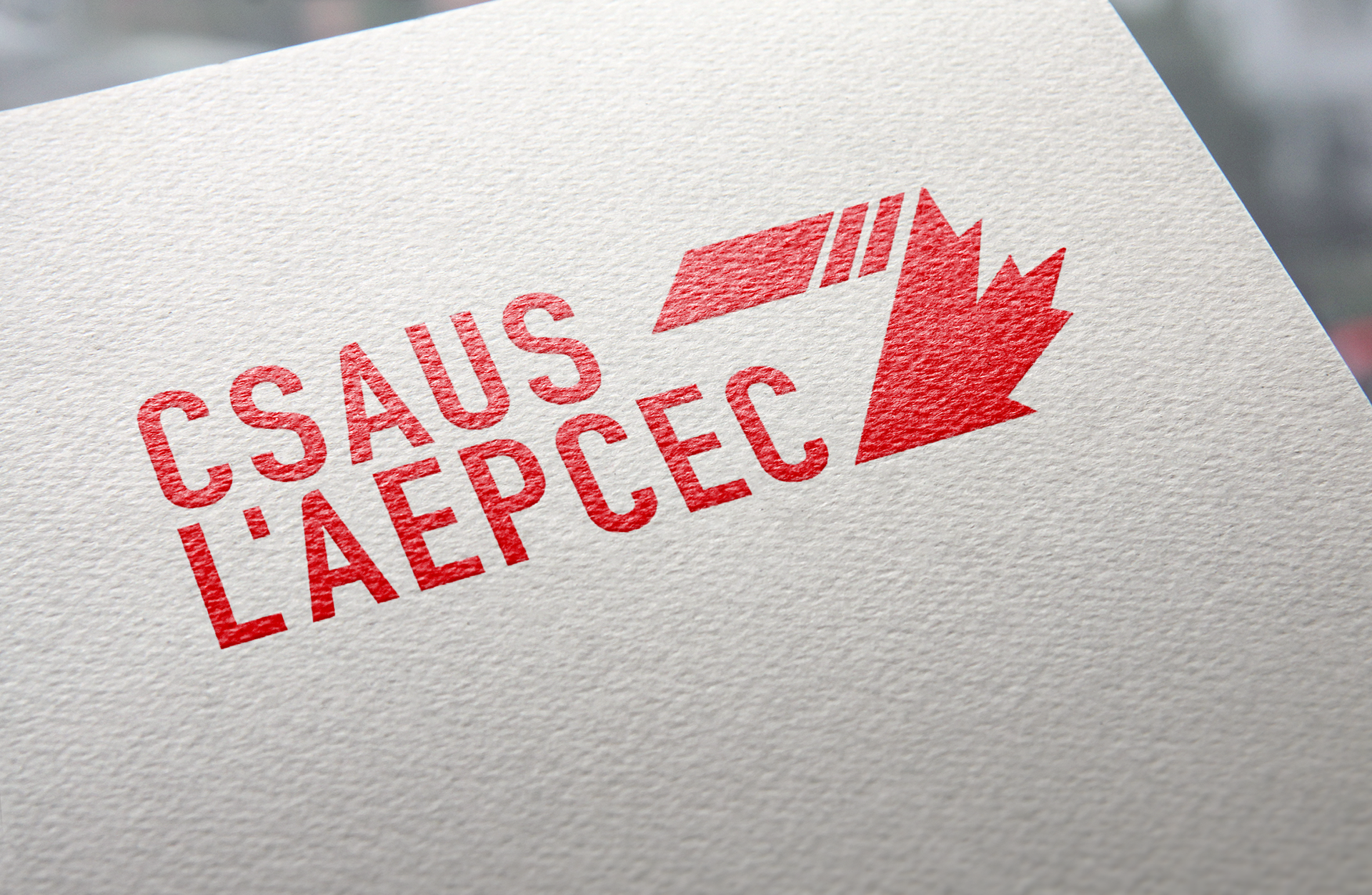
Working with input from the executive, I designed a smart logo. It plays off of the maxim of closed forms and movement. The use of the weighted lines and the slant of the elements creates the characteristic fold of a ribbon. This was purposeful and a hidden gift to those who notice it. It symbolizes unity, honour, and memory. The ribbon symbolically ties together two parts of the logo. The first are the slanted stripes. The stripes were inspired by the pages, binding, and spine of a book. The proportion is intended to symbolize Canada's 150th anniversary which fell in 2017. Moreover, they also are intended to embody the three major players in Canada's history. The largest block, the first one, is for the Indigenous Persons of Canada, whose lands we inhabit. The two smaller stripes are intended to represent the French and English peoples of Canada, coming afterwards.
The Slant is designed to symbolize movement forward.